Styled Components Media Queries
What are Styled Components?
Styled Components is a popular library for styling components in React applications. It allows developers to write CSS code using JavaScript syntax, making it easy to customize and style components. Styled Components provide a way to isolate styles within a particular component, ensuring that styles do not affect other components in the application. This improves code organization, reusability, and makes CSS code more maintainable.
Benefits of using Styled Components
There are several benefits to using Styled Components in your React applications. Firstly, it simplifies the process of styling components by allowing you to write CSS code directly within your JavaScript files. This eliminates the need to switch between different files, making the code more readable and maintainable.
Secondly, Styled Components provide a way to encapsulate styles within a single component, preventing styles from leaking out and affecting other components. This improves code organization and reusability, as styles are confined to the component where they are defined.
Thirdly, Styled Components offer dynamic styling capabilities, making it easy to create responsive designs. With the help of media queries, you can define different styles for different screen sizes, ensuring that your application looks great on all devices.
What are Media Queries?
Media queries are a CSS feature that allow you to apply different styles based on the characteristics of the device or viewport. Media queries can target various properties, such as screen width, height, orientation, and even the type of device being used (e.g., print, screen, handheld). By using media queries, you can create responsive designs that adapt to different screen sizes and devices.
How to use Media Queries with Styled Components
Using media queries with Styled Components is straightforward and follows a similar pattern to regular CSS. To use media queries, you first need to import the necessary functions from the Styled Components library:
“`javascript
import { css } from ‘styled-components’;
“`
Next, you can define your media query using the `css` function:
“`javascript
const Container = styled.div`
width: 100%;
${css`
@media (min-width: 768px) {
width: 50%;
}
`}
`;
“`
In the above example, we define a `Container` styled component that has a width of 100%. Within a media query, which targets a minimum width of 768 pixels, we override the width to be 50%. This means that when the screen width is at least 768 pixels, the `Container` component will have a width of 50%.
Examples of Styled Components with Media Queries
Let’s take a look at a few more examples of using media queries with Styled Components.
“`javascript
const Button = styled.button`
background-color: blue;
color: white;
${css`
@media (max-width: 480px) {
background-color: red;
}
@media (min-width: 768px) {
background-color: green;
}
`}
`;
“`
In the above example, we define a `Button` styled component with a blue background color and white text color. Within our media queries, we change the background color to red for screens with a maximum width of 480 pixels, and to green for screens with a minimum width of 768 pixels. This allows the button to adapt its appearance based on the screen size.
Best practices for using Styled Components with Media Queries
To ensure the smooth integration of media queries with Styled Components, here are some best practices to keep in mind:
1. Use descriptive breakpoints: Instead of relying on generic breakpoints, define named breakpoints that align with your design requirements. For example, instead of `@media (min-width: 768px)`, you could have `@media (min-width: tablet)`.
2. Create responsive styled components: Rather than applying media queries to individual components, consider creating responsive styled components. These components can encapsulate the necessary media queries inside them, making it easier to reuse and manage the styles across your application.
3. Utilize Styled-components global styles: Styled Components allow you to define global styles that will be applied throughout your application. These global styles can be combined with media queries to create consistent styles across different screen sizes.
4. Leverage React media query libraries: React has several popular libraries, such as React Responsive and React Media, that simplify the usage of media queries in your components. These libraries provide hooks or components that make it easier to conditionally render components based on the screen size.
5. Consider using a theme and the ThemeProvider: Styled Components’ ThemeProvider enables you to define a theme that can be accessed throughout your application. This theme can store values like breakpoints, colors, and other design-related properties, making it easy to use consistent values across media queries.
6. Use CSS variables: CSS variables can be used in conjunction with Styled Components to define dynamic values that can adapt to different screen sizes. By using CSS variables, you can write cleaner and more concise media queries by referencing these variables.
Babel-plugin-styled-components, Props styled-components, and Change theme styled-components are some additional tools and techniques that can enhance your experience working with Styled Components and media queries.
In conclusion, Styled Components provide a powerful and intuitive way to style components in React applications. By leveraging media queries, you can easily create responsive designs that adapt to different screen sizes and devices. By following best practices and utilizing tools like React media query libraries and CSS variables, you can effectively integrate media queries into your Styled Components and create robust and flexible designs.
047 Styled Components \U0026 Media Queries
Can We Use Media Query In Styled-Components?
Styled-components is a popular library that enables developers to write CSS in JavaScript, providing a more convenient and efficient way to style their React components. It allows for the creation of reusable and modular styles, making it easier to maintain and update codebases. However, one question that often arises is whether media queries can be used in conjunction with styled-components. In this article, we’ll delve into this topic and explore how media queries can be utilized within styled-components.
Understanding media queries
Before we discuss the integration of media queries in styled-components, it is important to understand what media queries are. Media queries are CSS techniques that enable the adaptation and customization of styles based on various device parameters, such as screen size, resolution, or orientation. They allow developers to create responsive designs that can cater to different devices and screen sizes.
The concept of media queries is not actually related to the specific styling library being used. In fact, media queries are part of CSS itself and can be used alongside any styling solution. Whether you are using traditional CSS stylesheets or CSS-in-JS solutions like styled-components, media queries can be written and applied in a similar manner.
Using media queries in styled-components
Styled-components provides a simple and intuitive way to incorporate media queries into your component styles. To start using media queries, you need to import the “css” helper from styled-components. This helper function allows you to write CSS code within JavaScript, making it easier to combine media queries with other styling rules.
Here’s an example of using media queries in styled-components:
“`jsx
import styled, { css } from ‘styled-components’;
const StyledComponent = styled.div`
/* styles without media queries */
${props => props.theme.media.desktop`
/* styles for desktop */
`}
${props => props.theme.media.tablet`
/* styles for tablet */
`}
${props => props.theme.media.mobile`
/* styles for mobile */
`}
`;
“`
In this example, the “StyledComponent” div is defined with three different media query styling blocks. The media query logic is encapsulated within the “props.theme.media” object, which is a common way to organize media queries in styled-components. You can define your own media query breakpoints and media query strings within the theme object to suit your project’s requirements.
The media query styles are wrapped inside backticks and are enclosed within the “css” helper function. This ensures that the media query styles are evaluated correctly within the styled-components context.
Frequently Asked Questions
Q: Can I use multiple media queries within a single styled-component?
A: Yes, you can use multiple media queries within a single styled-component. You can define as many media query blocks as required based on the design requirements of your component. Each media query block can contain its own set of styles that will be applied when the specified media query matches.
Q: How do I define custom media queries for my project?
A: To define custom media queries for your project, you can create a “theme” object in styled-components. Within this theme object, you can define your own media query breakpoints and associated media query strings using the “css” helper. By organizing your media queries within a theme object, you can easily reuse them across your components.
Q: Can I pass media query props to styled-components?
A: Yes, you can pass media query props to styled-components. This can be useful when you want to dynamically update styles based on particular conditions. For example, you can pass a prop that determines if a particular media query should be applied or not. Based on the prop value, you can apply or omit the media query styles.
Q: Can I nest media queries within styled-components?
A: While styled-components themselves do not support nested media queries, you can still achieve nested media query styles by applying the regular CSS methodology. You can create multiple styled-components, each with its own media query block, and then nest them within a parent component, allowing you to achieve the desired level of nested media query styles.
In conclusion, styled-components do support the use of media queries, allowing developers to create responsive designs within their React components. By leveraging the power of media queries alongside the simplicity and reusability of styled-components, you can build flexible and adaptable UIs that cater to various device parameters.
Is Styled-Components Better Than Sass?
When it comes to styling our web applications, there are numerous options available to us. Two popular choices are styled-components and Sass. Both of these tools offer their unique benefits and have a significant impact on the way we write and maintain our CSS. In this article, we will delve into the debate of whether styled-components is better than Sass, exploring their pros and cons and providing insights into which one might be the best fit for your project.
Styled-components is a powerful CSS-in-JS library that enables developers to write CSS styles inside JavaScript files. It allows for the creation of reusable, scoped and dynamic styles, reducing the possibility of style conflicts. Sass, on the other hand, is a preprocessor that extends the capabilities of CSS by introducing variables, nesting, mixins, and other powerful features.
One of the key advantages that styled-components brings to the table is the concept of component-based styling. Since styles are attached directly to components, they become self-contained and isolated. This can lead to improved code organization and reusability, as styles are scoped to specific components and don’t leak into other parts of the application. This approach also allows for the creation of dynamic styles using props, making it easy to handle different states or variations of a component without the need for additional CSS classes.
By using styled-components, developers can take advantage of JavaScript’s programming capabilities to create more expressive and powerful styles. This means that complex logic can be used to calculate styles, making it easier to handle responsive layouts, dark mode themes, or any other dynamic styling requirement. Additionally, styled-components offers full access to all of the JavaScript ecosystem, including the ability to import external libraries, integrate with state management tools, or even generate styles dynamically based on data from APIs.
Another benefit of styled-components is its superior developer experience. It offers a vibrant and intuitive API that makes it easy to define and modify styles. The use of tagged template literals allows for the inline definition of styles, providing a clear separation between CSS and JavaScript. Furthermore, styled-components provides excellent tooling support, including syntax highlighting, linting, and autocompletion. This makes the development process more efficient and helps catch potential issues before they become bugs.
While Sass doesn’t offer the same level of component-based styling as styled-components, it excels in other areas. Its rich set of features such as variables, nesting, mixins, and functions make it a powerful tool for maintaining large and complex stylesheets. With Sass, developers can organize their CSS in a structured manner, reducing repetition and improving maintainability. This is particularly useful when working on projects with multiple developers or teams, as it establishes a consistent and scalable way of writing styles.
Sass also provides a wide variety of third-party extensions and frameworks, such as Compass or Bourbon, that can further enhance its capabilities. These extensions offer ready-to-use functions and mixins that speed up the development process and provide additional features like browser compatibility or animation utilities. Additionally, Sass allows for the modularization of styles through the use of partials and imports, making it easy to separate concerns and organize styles into manageable pieces.
Now that we have explored the strengths of both styled-components and Sass, it is important to mention that determining which one is better ultimately depends on the specific requirements of your project. If you value component-based styling, dynamic styles, and a seamless integration with the JavaScript ecosystem, then styled-components might be the better choice. On the other hand, if you prioritize powerful features like variables, nesting, and mixins, and work on a project where a large and scalable codebase is essential, then Sass might be the way to go.
FAQs:
Q: Can styled-components be used with Sass?
A: Yes, styled-components can be used in combination with Sass. styled-components primarily handles the scope and creation of components, while Sass can help with organizing and extending the stylesheets themselves.
Q: Does using styled-components affect performance?
A: styled-components has a minimal performance impact compared to traditional CSS solutions. In fact, due to its automatic dead-code elimination and ability to generate optimized CSS, it can sometimes perform better than solutions based on classes.
Q: Are there any downsides to using styled-components?
A: styled-components may have a learning curve for developers accustomed to writing CSS in separate files. There may also be concerns about the generated CSS size, although this can be mitigated using techniques like code splitting or server-side rendering. Additionally, styled-components may not be suitable for projects with strict CSS requirements or where caching of CSS files is essential.
Q: Can I switch from Sass to styled-components in an existing project?
A: Yes, it is possible to migrate from Sass to styled-components in an existing project. However, it would require rewriting the styling code and potentially refactoring parts of the application. It is advisable to carefully evaluate the benefits and trade-offs before deciding to make the switch.
In conclusion, deciding between styled-components and Sass depends on your project’s specific needs and priorities. styled-components excels in component-based styling and dynamic styles, while Sass offers a powerful set of features and a well-established ecosystem. Evaluating the strengths and weaknesses of each tool will help you make an informed decision and create a maintainable and efficient CSS workflow for your web application.
Keywords searched by users: styled components media queries Responsive styled components, Styled-components global styles, React media query, Change theme styled-components, Babel-plugin-styled-components, Props styled-components, ThemeProvider styled-components, CSS variables styled components
Categories: Top 45 Styled Components Media Queries
See more here: nhanvietluanvan.com
Responsive Styled Components
In today’s digital age, where users access websites and applications on various devices and screen sizes, ensuring a seamless user experience across platforms has become an essential priority for businesses and developers. Responsive design has emerged as a key solution, adapting layouts to different screen sizes. However, implementing responsive design with traditional CSS can be complex and time-consuming. Thankfully, responsive styled components have emerged as a powerful tool to simplify this process and enhance both the developer and user experience.
Understanding Responsive Styled Components
Responsive styled components are a combination of two popular web development tools: responsive design and styled components. Styled components, a CSS-in-JS library, allow developers to create reusable and encapsulated UI components with unique styles. On the other hand, responsive design is an approach that allows the user interface to adapt and resize according to the screen size and orientation.
By combining these two concepts, developers can build responsive UI components that automatically adjust their styles based on the dimensions of the viewport. This approach eliminates the need for writing extensive media queries or duplicating styles for different screen sizes, leading to more efficient and maintainable code.
Benefits of Using Responsive Styled Components
1. Simplified Styling Process: With responsive styled components, developers can define styles using the component’s props or context. This eliminates the need to write and manage separate CSS files, resulting in a more streamlined development process. Additionally, styling can be done within the component, making it more modular and reusable.
2. Improved Performance: By eliminating the need for media queries and reducing CSS duplication, responsive styled components lead to lighter and faster websites. The browser only renders the CSS styles needed for the current viewport, optimizing performance and reducing network requests.
3. Enhanced Flexibility: With responsive styled components, developers can easily build adaptive and flexible layouts that respond to changes in both screen size and content. This scalability enables a seamless user experience on any device or screen orientation, ensuring that your website or application is accessible to the widest possible audience.
4. Maintainable Codebase: Managing different CSS files for various screen sizes can quickly become a headache. With responsive styled components, developers can maintain a single codebase that adapts to different screen sizes. This approach reduces code redundancy and makes maintenance and updates more manageable.
Best Practices for Implementing Responsive Styled Components
1. Define Breakpoints: Breakpoints determine the different screen sizes at which the components should adapt. By defining breakpoints using CSS variables or JavaScript constants, developers can ensure consistency and maintainability across the project.
2. Use Flexbox or Grid: Utilize CSS flexbox or grid to build responsive layouts. These modern CSS properties provide a flexible and efficient way to structure components, making them mobile-friendly and adaptable to different screen sizes.
3. Utilize Media-Based Context: Styled components allow the passing of context through the theme provider. This feature enables the components to access the current viewport dimensions, allowing more granular control over the styling and behavior of the components.
4. Test Across Devices: Responsive design requires thorough testing across different devices and screen sizes. Use emulators, physical devices, or browser developer tools to ensure that your components respond as expected in different scenarios.
FAQs
Q: Can I still use responsive styled components with traditional CSS?
A: Yes, you can combine responsive styled components with traditional CSS. Styled components’ powerful features, such as props-based styling and context, can seamlessly integrate with CSS within the application. This provides enhanced flexibility and ensures a smooth transition for existing CSS codebases.
Q: Are there any performance concerns when using responsive styled components?
A: Responsive styled components, when implemented correctly, can actually enhance performance by reducing CSS duplication and optimizing rendering. However, excessive re-rendering or overuse of media queries can impact performance. Therefore, it’s important to test and optimize your implementation for the best performance results.
Q: Can I use responsive styled components in any JavaScript framework?
A: Absolutely! Responsive styled components are framework-agnostic and can be used in popular JavaScript frameworks like React, Vue.js, Angular, and more. They offer a consistent approach to building responsive and adaptive user interfaces across different frameworks.
Q: How do responsive styled components compare to CSS frameworks like Bootstrap or Foundation?
A: Responsive styled components offer more flexible and customizable solutions compared to CSS frameworks like Bootstrap or Foundation. While CSS frameworks provide pre-built styles and components, responsive styled components allow developers to create their own reusable and self-contained UI components with tailored styles, resulting in a more lightweight and efficient implementation.
In conclusion, responsive styled components are a powerful tool for creating responsive and adaptive user interfaces. By simplifying the styling process, improving performance, and enhancing flexibility, they empower developers to deliver seamless user experiences across multiple devices and screen sizes. As the demand for responsive design continues to grow, embracing responsive styled components can undoubtedly elevate both the development process and the end-user experience.
Styled-Components Global Styles
Global styles are useful for setting up a consistent look and feel across an application, applying customizations to HTML elements, or overriding default styles of third-party libraries. In this article, we will explore how to use global styles in styled-components and the benefits they bring to the development process.
To start using global styles in styled-components, we need to create a component that will hold the global styles. This component acts as a wrapper around our entire application and ensures that the styles are applied globally.
Here’s an example of how to create a global styles component:
“`
import { createGlobalStyle } from ‘styled-components’;
const GlobalStyle = createGlobalStyle`
body {
background-color: #f5f5f5;
font-family: Arial, sans-serif;
}
h1 {
color: #333;
font-size: 24px;
}
/* Additional global styles */
`;
export default GlobalStyle;
“`
In the example above, we are using the `createGlobalStyle` function from styled-components to define our global styles. Inside the template literal, we can write regular CSS code that will be applied globally.
Once we have the global styles component defined, we can simply import it and include it in our root component. This ensures that the styles are applied to the entire application:
“`
import React from ‘react’;
import ReactDOM from ‘react-dom’;
import App from ‘./App’;
import GlobalStyle from ‘./GlobalStyle’;
ReactDOM.render(
<>
,
document.getElementById(‘root’)
);
“`
By including the `GlobalStyle` component above the `App` component, we ensure that the global styles are applied before any other styles in the application.
Global styles have a number of benefits in a styled-components application. Firstly, they provide a centralized place to define styles that will be applied globally, making it easier to maintain and update the overall look and feel of the application.
Secondly, global styles allow for easy customization of HTML elements. For example, we can override the default styles of `button` elements by simply targeting them in the global styles component:
“`
const GlobalStyle = createGlobalStyle`
button {
background-color: #007bff;
color: #fff;
padding: 10px 20px;
font-size: 16px;
border: none;
border-radius: 4px;
cursor: pointer;
}
`;
“`
In the example above, we are setting a custom background color, text color, padding, font size, border, border radius, and cursor for all `button` elements in our application.
Lastly, global styles are also handy for quickly customizing third-party components. If we are using a UI library that provides styled-components support, we can override the default styles of those components by targeting them in the global styles component, ensuring a consistent look and feel in our application.
Overall, global styles in styled-components provide a powerful way to define styles that apply to the entire application, resulting in a consistent and cohesive user experience.
————–
FAQs:
Q: Can I use global styles with other styling libraries in my React application?
A: Yes, global styles in styled-components can be used alongside other styling libraries such as CSS modules or CSS-in-JS. However, care should be taken to avoid conflicting styles and ensure a consistent design.
Q: How can I update the global styles dynamically during runtime?
A: The global styles defined in the `createGlobalStyle` component are static, meaning they are not connected to any state. To update the styles dynamically, consider using React state or props to conditionally apply different styles.
Q: Are there any performance considerations when using global styles in styled-components?
A: The performance impact of global styles in styled-components is minimal. The library generates unique class names for each styled component, which helps optimize the rendering process and reduce the chances of CSS clashes.
Q: Can I have multiple global styles components in my application?
A: Yes, you can have multiple global styles components in your application by simply creating more instances of the `createGlobalStyle` function. However, it is generally recommended to keep the global styles centralized in a single component for better maintainability and consistency.
Images related to the topic styled components media queries
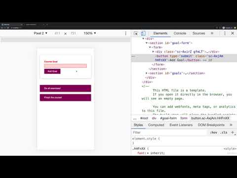
Found 36 images related to styled components media queries theme


![React styled components / styled-components [V5 EDITION] | Udemy React Styled Components / Styled-Components [V5 Edition] | Udemy](https://img-c.udemycdn.com/course/750x422/1797176_13dc_11.jpg)


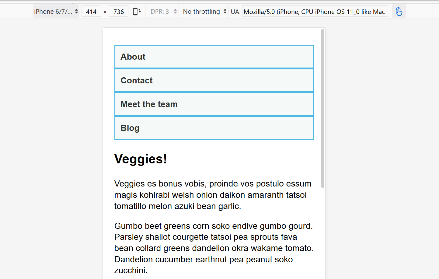





Article link: styled components media queries.
Learn more about the topic styled components media queries.
- How to use media queries with styled components
- How to use media queries in styled components
- How to use Media Queries inside a React Styled Components …
- Media queries with styled components – Mario Kandut
- SCSS vs. styled-components: Advantages and caveats
- Basics – styled-components
- Pros And Cons Of Using Styled Components In React – LinkedIn
- Media queries with styled components – Mario Kandut
- How to use media queries in styled components
- styled-components-media-query
- Media queries & custom props on Styled Components | React
See more: https://nhanvietluanvan.com/luat-hoc/